About Lesson
Data Visualization
Warm-Up
1. The Smartphone Test
Look at your phone’s battery icon. Do you prefer to see the big green bar or just the small number (82%)?
2. The Shopping Trip
“Imagine you want to buy a new phone. You have two options:
Option A: A long list of 20 prices.
Option B: A simple bar chart (стовпчаста діаграма). Which one is faster to find the cheapest phone?”
3. The “Story” of a Day
“Think about your temperature when you have a cold.
Morning: 37.5°C
Lunch: 38.5°C
Evening: 37.0°C
Is it easier to see your progress in a list or by drawing a line on a graph?”
Vocabulary Practice
5 Game-Changing Data Visualization Techniques – pre-listening
Listening Practice
Write down the graph names that are mentioned in the video.
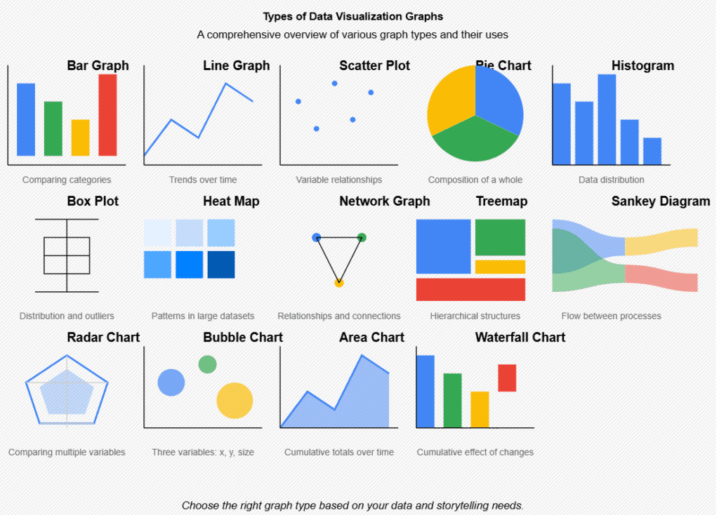
Common graphs
Graph vs chart
Graph
- More common in maths, science, and academic contexts
- Emphasizes the relationship between variables (e.g., x and y)
- Often used when talking about formulas or continuous data
Example:
- “The line graph shows the relationship between temperature and pressure.”
Chart
- More common in business, reports, and presentations
- Emphasizes visualizing trends over time
- Often used in tools like Excel or PowerPoint
Example:
- “The line chart shows sales growth over the last year.”
*Remember: Always say pie chart (not pie graph)