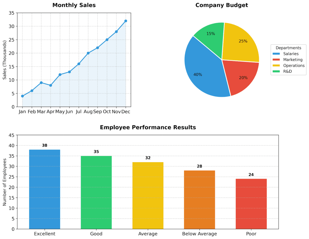
Presenting Data & Graphs Analysis
Vocabulary Practice
Graphs & Charts Descriptions – Examples
*A gentle reminder, a graph is more common in maths, science, and academic contexts, while a chart is more common in business, reports, and presentations
1. Line Chart: Showing Trends Over Time
When do we use it?
We use a line chart to show changes over time (for example: days, months, or years).
It is also useful to compare different trends.
What data do we need?
- X-axis: time (days, months, years)
- Y-axis: numbers (sales, temperature, users)
Examples:
- Stock prices during the year
- Website traffic each month
- Temperature changes in different seasons
Description:
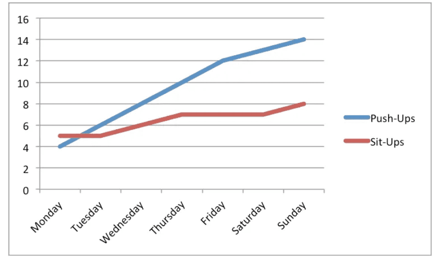
Let’s look at the data.
The chart illustrates weekly exercise results.
Push-ups showed a strong increase over time. The number grew from 4 to 14, with a clear upward trend.
In comparison, sit-ups increased more slowly. There was a slight rise at the beginning, then the number remained stable for a short period, and finally increased again.
Compared to push-ups, sit-ups did not grow as much.
Overall, the performance improved during the week.
2. Pie Chart
When do we use it?
A pie chart shows parts of a whole. Each part is shown as a percentage.
It is best to use a pie chart when you have only a few categories. Too many parts can make it difficult to read.
What data do we need?
- Different groups or categories
- Percentages
Examples:
- Brand popularity
- Company budget
- Customer opinions
Description:
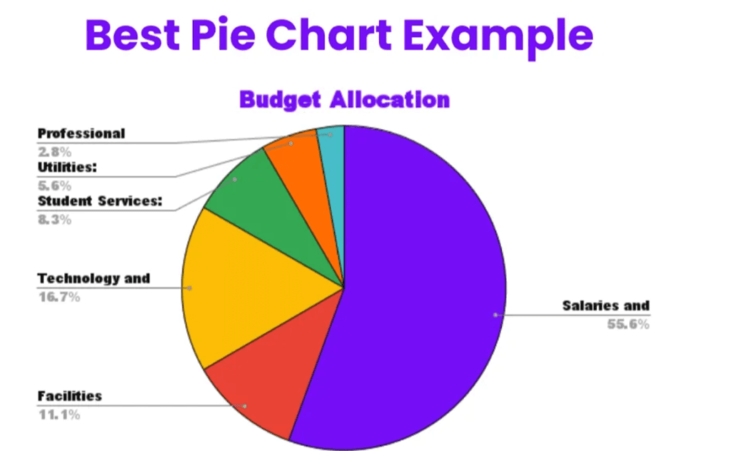
Let’s look at the data for this chart.
This chart illustrates budget allocation. It shows how the total budget is divided into different categories.
According to the chart, salaries and wages take the largest part, at about 55.6%. This is the biggest share.
Technology is the second largest category, with around 16.7%. Facilities account for about 11.1%.
Student services make up approximately 8.3%, while utilities are lower at 5.6%. Professional expenses are the smallest category, at only 2.8%.
Overall, most of the budget is spent on salaries.
The key point is that salaries take more than half of the total budget.
In conclusion, the distribution is not equal, and one category is significantly higher than the others.
3. Bar Chart (Horizontal)
When do we use it?
We use a horizontal bar chart to compare different categories.
It is especially useful when the category names are long.
We can also use it to show ranking (from highest to lowest).
What data do we need?
- Y-axis: categories (for example: product names or countries)
- X-axis: numbers (for example: sales or population)
Examples:
- Best-selling products in a shop
- Employee performance results
- Population in different countries
Description:
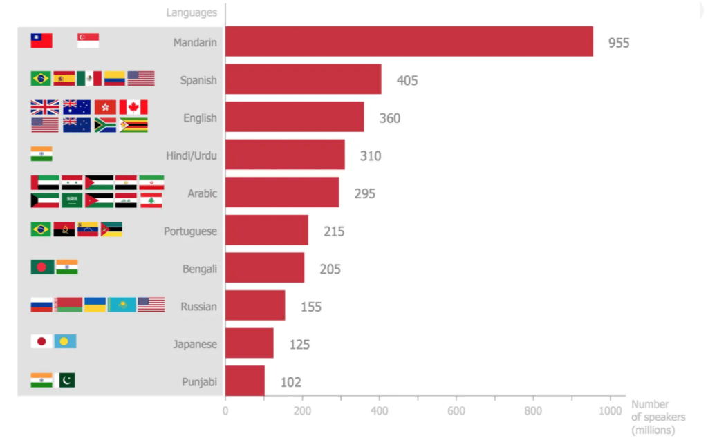
Let’s look at the data in this chart.
The chart shows the number of speakers of different languages worldwide (in millions).
According to the chart, Mandarin has the highest number of speakers, at about 955 million.
Spanish is the second most spoken language, with around 405 million speakers. English follows with about 360 million.
Hindi/Urdu and Arabic have similar numbers, at approximately 310 and 295 million.
Portuguese and Bengali have lower figures, at about 215 and 205 million. Russian, Japanese, and Punjabi have the smallest numbers, with 155, 125, and 102 million speakers.
Overall, Mandarin is significantly higher than the other languages.
The key point is that the number of Mandarin speakers is much larger than any other language.
In conclusion, the distribution shows a clear difference between the top language and the rest.
Homework
Describe the 3 charts using the new vocabulary and examples from this lesson.